

Quick answer: an infographic turns information into a picture your reader understands faster than they could read it. There are ten types worth knowing — statistical, informational, timeline, process, geographic, anatomical, comparison, hierarchical, list and visual resume — and the right one is decided by the shape of your data, not by which layout looks nicest. Numbers want a statistical infographic. Steps want a process infographic. Dates want a timeline.
What is an infographic?
An infographic is a visual presentation of ideas, data or knowledge designed to teach the reader by showing rather than telling. It is a combination of information and graphic design — the data does the work, the design makes the data readable.
Marketers use infographics because they get shared and linked far more often than plain text. Bloggers and content writers use them to break up long articles and hold attention. Educators use them because a well-structured graphic is easier to remember than a paragraph.
What infographics are actually for
Infographics carry information with less friction than text. That makes them useful well beyond marketing:
- Marketing — digital marketers, social media managers and content writers use them to earn shares and backlinks.
- Education — teachers, lecturers and trainers use them to improve recall.
- Instruction — signage, newspapers, magazines and bulletin boards.
- Nonprofit — raising awareness of a social issue with a single memorable statistic.
- Design — inside websites, blog posts and app interfaces, where they replace walls of copy.
The 10 types of infographics
1. Statistical infographic
Bar graphs, line graphs, histograms, pie charts and similar diagrams. Built to summarise gathered data such as survey results.
Use it when: your takeaway is a number. One headline figure, supported by two or three smaller ones, beats a dashboard of twelve charts nobody reads.
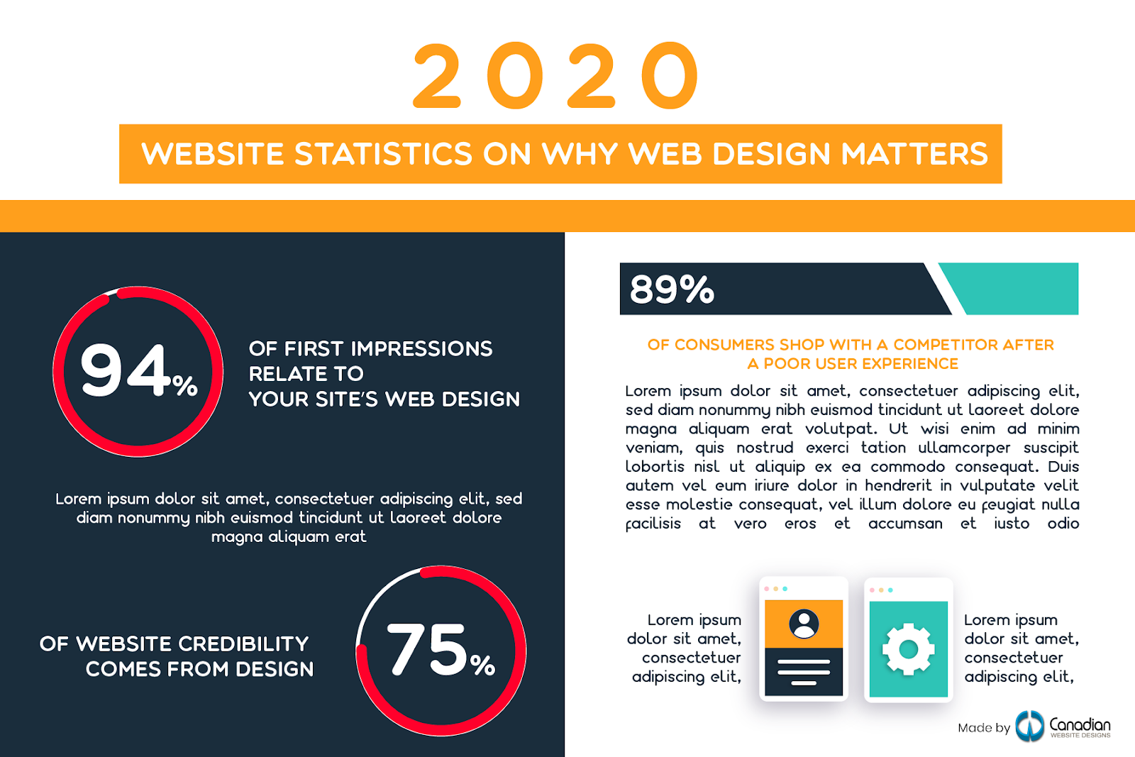
2. Informational infographic
Mostly text, organised into clear visual sections with icons and colour blocks. The workhorse type for explaining a concept that has no numbers attached.
Use it when: you are teaching an idea rather than reporting data — onboarding material, policy explainers, course summaries.
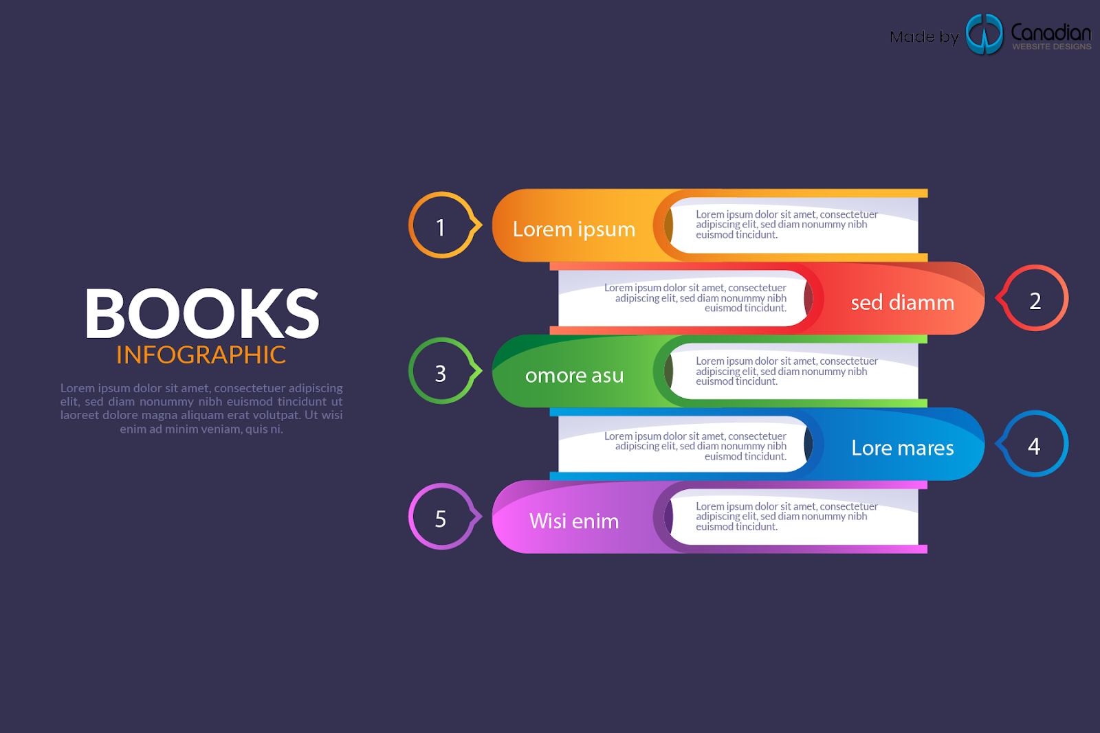
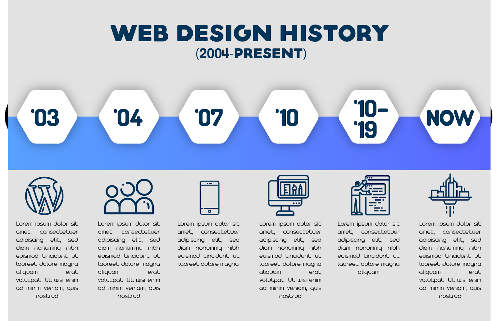
3. Timeline infographic
An organised sequence of dates or years running early to current, each with a short description and a relevant image. History and biography are the classic uses.
Use it when: the story is "what happened, in order" — company milestones, product evolution, the history of a discipline.
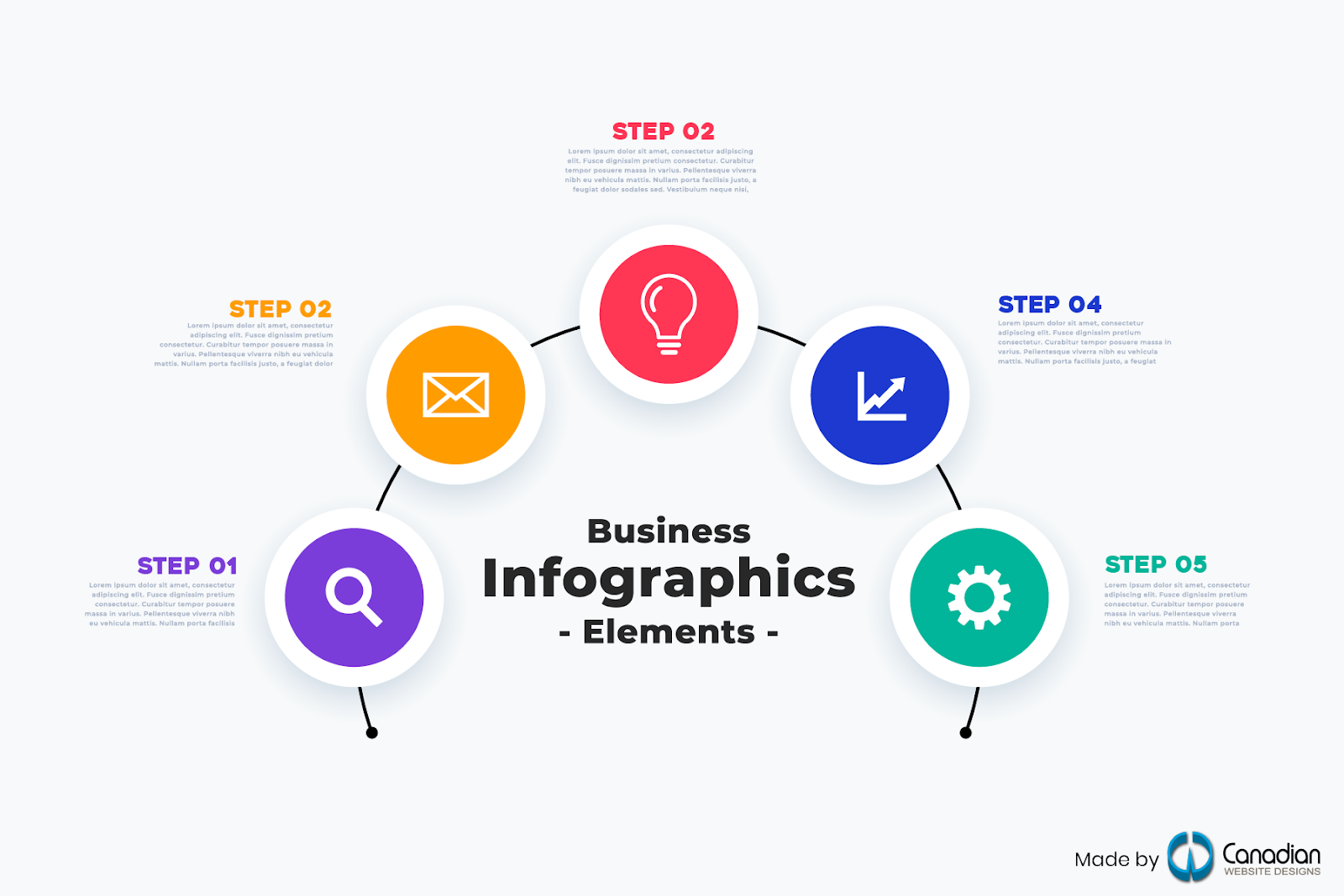
4. Process infographic
Visual instructions, numbered and in order. How-to guides and step-by-step tutorials are the obvious cases, and they turn up everywhere from schools to online stores to social media.
Use it when: someone has to do something in a particular order. Keep it to five to seven steps — past that, split it into two graphics.
5. Geographic infographic
Built around a place, a city or a map. Used to give directions, show population, or highlight regions within a country.
Use it when: location is the point — service areas, store coverage, regional performance differences.

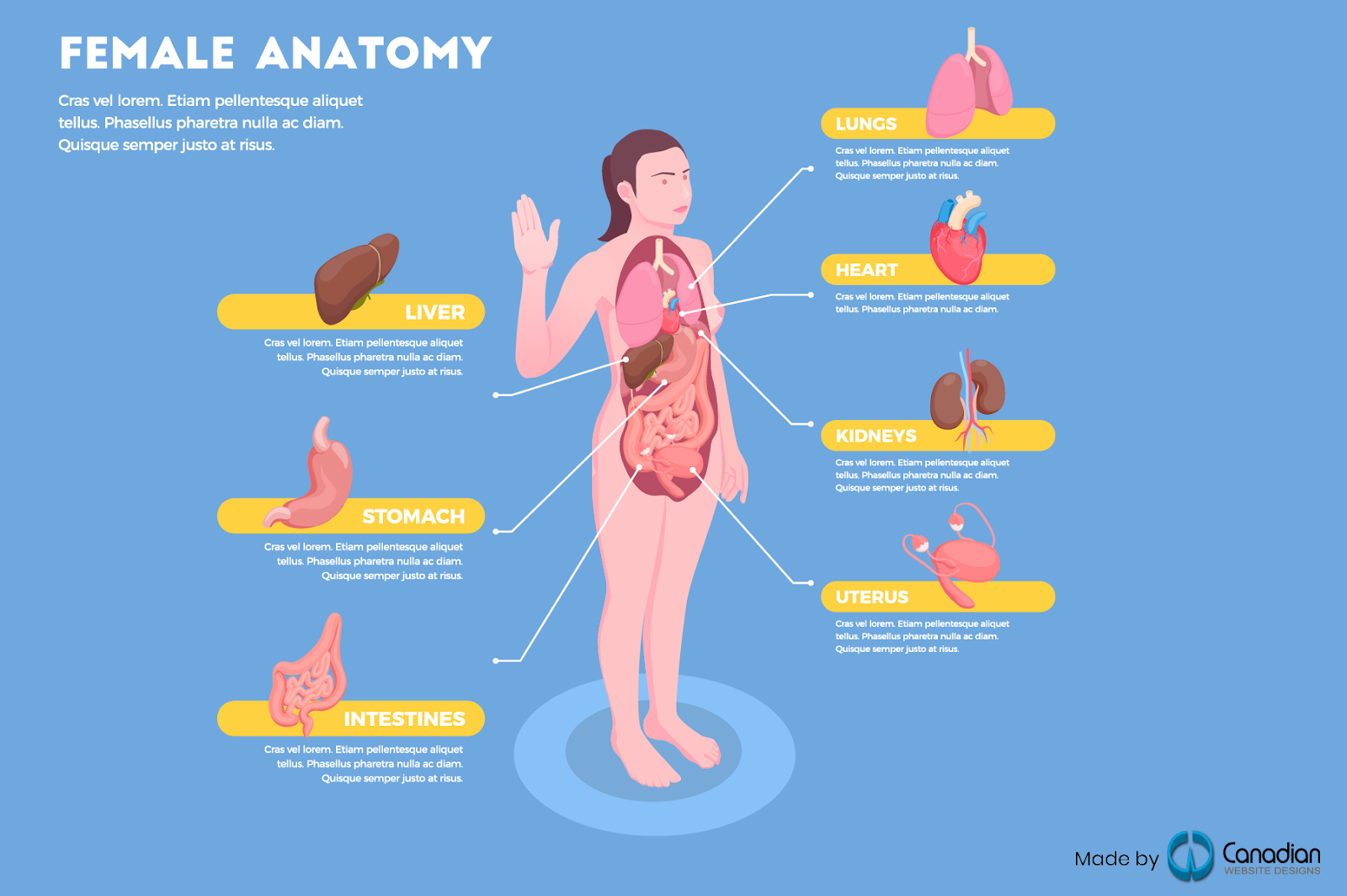
6. Anatomical infographic
A labelled breakdown of the parts of a thing, each with its name and function. Human anatomy is the textbook example, but the same structure works for a machine, a product, or a web page.
Use it when: you need to name the components of something and explain what each does.
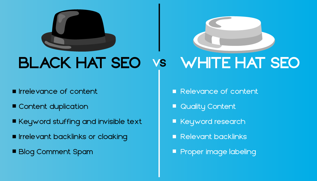
7. Comparison infographic
Two subjects set against each other — the familiar "vs." layout. Leader versus boss, one platform versus another, before versus after.
Use it when: the reader is deciding between options. Related reading: our breakdown of Webflow vs Squarespace vs WordPress, which is this format in article form.
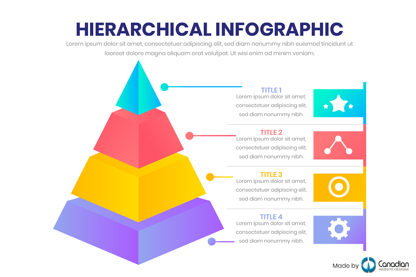
8. Hierarchical infographic
Information organised by level, bottom to top or top to bottom. Maslow's hierarchy of needs is the best-known example; pyramid charts and iceberg diagrams are the common forms.
Use it when: the levels genuinely rank — priority, seniority, depth. If the items are merely grouped rather than ranked, use a list instead.
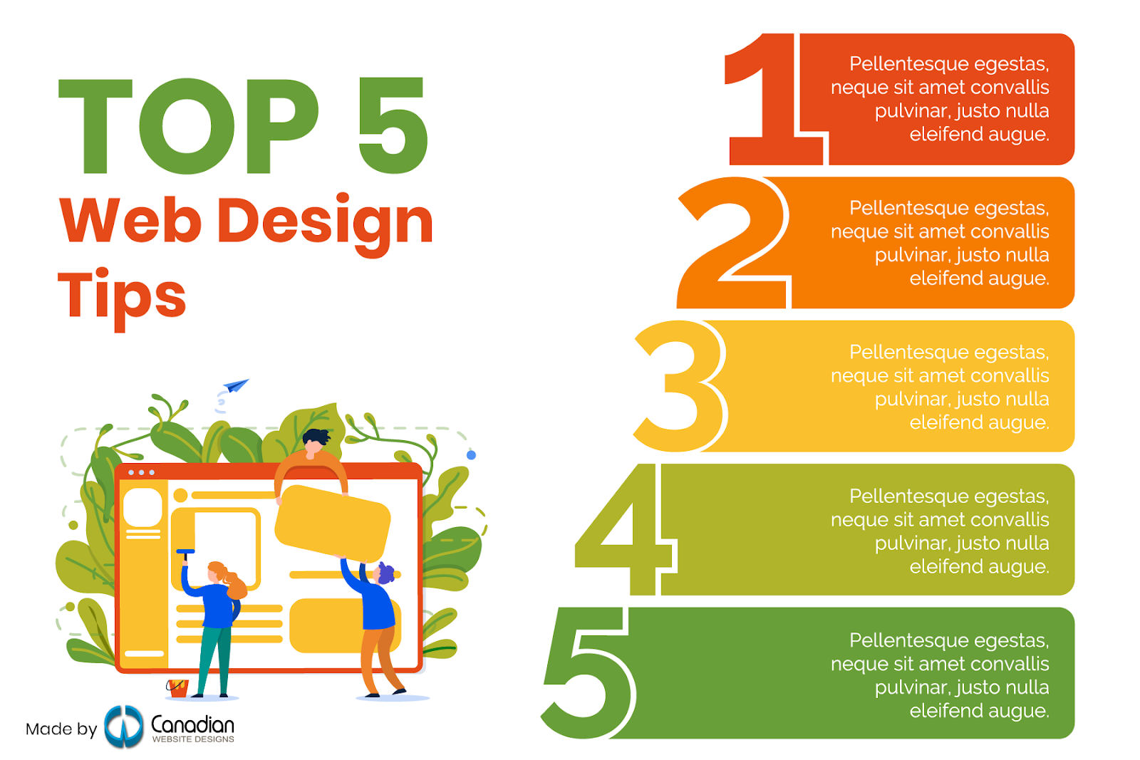
9. List infographic
A numbered or bulleted list dressed up with images and design. Used for both educational and corporate presentations, and heavily on social media.
Use it when: the items have no order and no ranking — tips, tools, reminders. It is the most forgiving type and the easiest to overuse.
10. Visual resume infographic
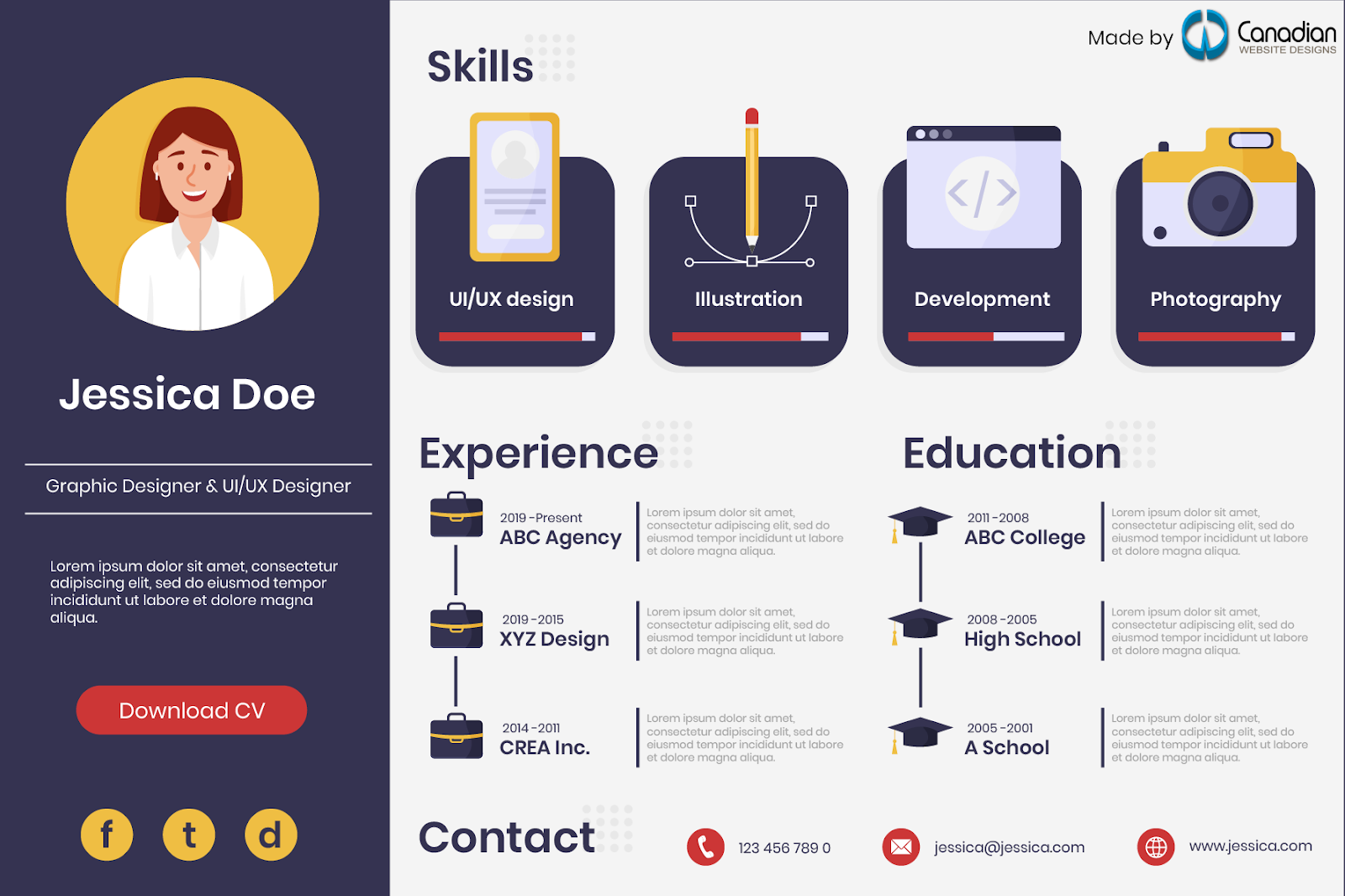
A resume built as a graphic — skills, interests and background presented visually. Graphic designers and digital artists use it to demonstrate the skill while describing it, sometimes with an illustrated avatar as the profile image.
Use it when: you are applying for a role where visual craft is the qualification. In most other fields, a conventional resume parses better through applicant tracking systems.
How to choose the right type
Work backwards from your content rather than forwards from a template:
- Your data is numbers → statistical
- Your data is steps in order → process
- Your data is events across dates → timeline
- Your data is two options weighed up → comparison
- Your data is ranked levels → hierarchical
- Your data is tied to places → geographic
- Your data is the parts of one thing → anatomical
- Your data is an unordered set of points → list
- Your data is a concept with no numbers → informational
If your content doesn't fit any of these shapes, it isn't ready to be an infographic yet. Three rules apply to all ten types: one idea per graphic, a reading path that runs clearly top to bottom, and text large enough to survive being viewed on a phone — which is where most of your readers will see it.
Final thoughts
Infographics work because they lower the effort of understanding. Adding the right one to a learning resource, a report or a blog post holds attention that plain text loses — provided the type matches the data. Choosing the wrong format is what makes an infographic look busy rather than clear.
Need an infographic designed?
Our graphic design team produces infographics, business cards and promotional material for clients across Canada and abroad. Because the work varies so much by scope, we quote graphic design per project rather than selling a fixed package — send us the content and we'll price it.
Call 647-689-6069, email sales@canadianwebdesigns.ca, or get in touch here. Our office is at 202-5 Cherrycrest Drive, Brampton, ON L6P 3W4.


