Have you ever noticed the wordmarks of some famous big companies? Like Coca-Cola, Instagram, Cadbury, etc., some are curvy, and some are plain and bold. This is how they represent their brand, company, and products. In this blog, you will learn more about typography and different typefaces.
What is Typography?
Typography is a group of decorative digital letterings that are being arranged and styled. They’re mostly seen in logos, wordmarks, websites, a cover of e-books, albums, banners, ads, and other promotional materials. Many graphic designers and web developers use some techniques in making digital letterings look more appealing, clear, and readable in appearance.
Benefits of Typography
Typography captures the attention of users
Admit it, when you see attractive typography on a book, you pause for a moment to stare at the front of the book to see how the letters are styled on it. That’s a power of typography, it captures your attention to notice and appreciate them.
Typography represents the company and brand
Most big companies use typography in designing brands, logos, and wordmarks in order to be easily recognized by the consumers. Good typography often boosts the brand recognition of the company in online and offline markets. Choosing the right typefaces and designs can result in a remarkable and iconic presence.
Typography communicates you
A digital presentation of words like typography can deliver a message and serves as visual interaction between the writer and readers. According to a famous advertising and media personality, Laura Worthington described typography as a visual voice, it imparts a voice without reading it. The unique personalities and emotions of every typeface and fonts can impact the perception of readers.
Typography can be tricky
Effective innovation of typography can manipulate feelings of excitement and other reactions from readers. It can also attract and influence the purchasing decisions of consumers.
Compositional Elements of Typography
Choosing your style on typography can be challenging. Here are some essential elements you need to know to improve the creation of your typography:
Color
Color is the most common element in all forms of art. The main aspect of color is to make letters to become more alive and eye-catching for all readers. Choosing the right color in your creation of typography is very important. Applying an appropriate combination of colors can reflect the professionalism and attractiveness of the concept.
Typeface and fonts
Many people are being confused about the difference between typeface and fonts. A typeface is a set of designed characters and other elements including font size, weight, shape, and spacing. While on the other hand, a combination of typefaces such as size, weight, and spacings are called fonts. The selection of the right typeface and application of fonts is important to graphic designers for a clear and readable presentation of texts or phrases in typography.
Alignment
Alignment is simply defined as the placement of words or phrases in typography. Most graphic designers prefer to use justified or centered alignment to look more presentable in terms of creating wordmarks or logos.
Whitespace
The whitespace (also known as negative space) is a space between the compositional elements such as letters, numbers, and symbols. Applying whitespace in your typography is important for balancing and organizing between the text, designs, and spaces.
Hierarchy
Proper organizing of words or phrases for clear and readable visual presentation is very important for graphic designers. Seeing messy and unorganized typography typically cause discomfort to the readers.
Different Classification of Typeface in Typography
Serif Typeface
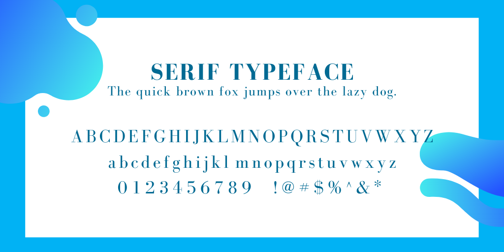
Other categories of Serif typeface:
- Old Style
- Transitional
- Neoclassical
- Didone
- Modern
- Slab
- Clarendon
- Glyphic
San Serif Typeface
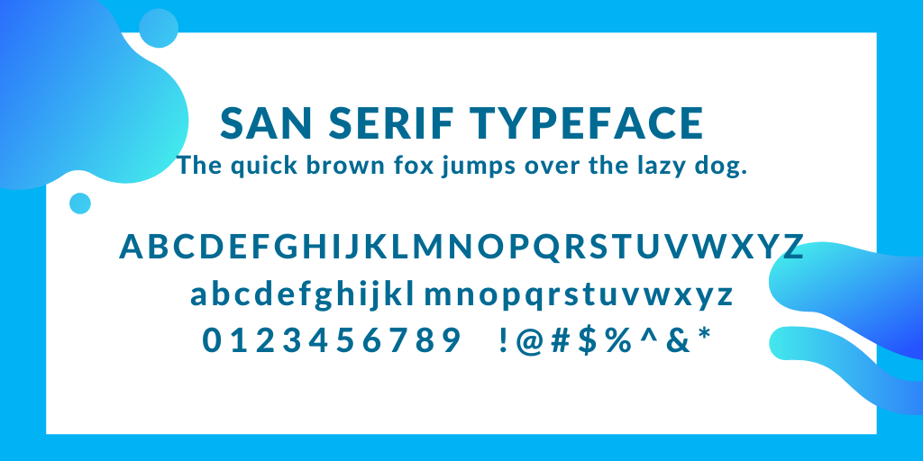
Unlike Serif, San Serif does not have an embellishment at the end of a larger stroke in characters. Clean, plain, and rounded strokes of Sans Serif fonts symbolize modern emotions and simplicity. This fonts’ informal appearance creates more approachable, friendly, and youthful looks.
Other categories of San Serif typeface:
- Grotesque
- Square
- Humanistic
- Geometric
Script Typeface
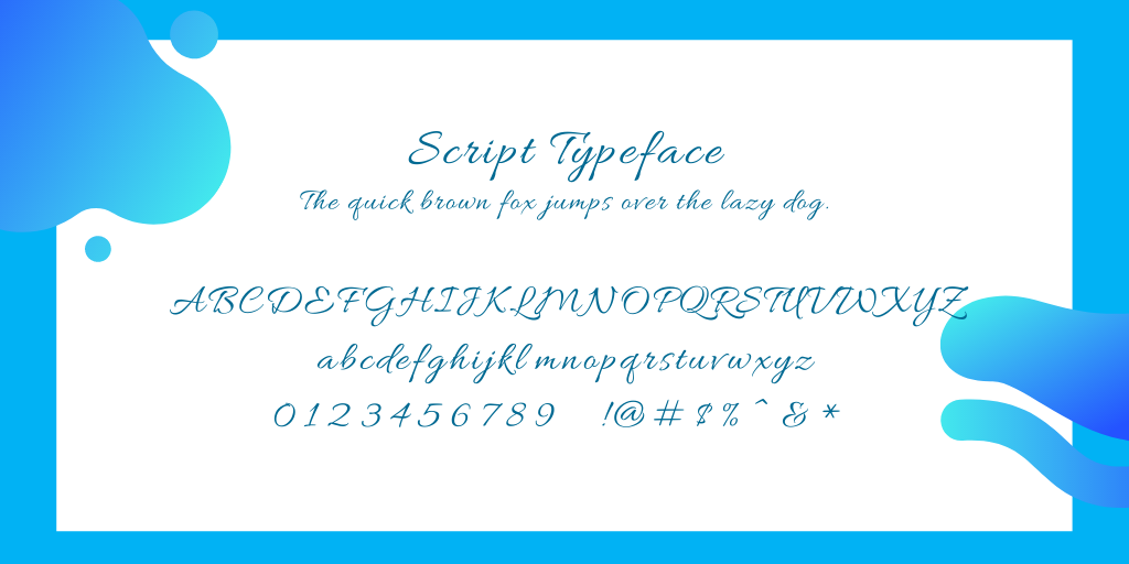
Script typefaces look like digital calligraphy with the features of cursive and stylized handwritten fluid strokes. The casual looking typeface shows creativity and cleverness. A Script typeface is often used for display purposes specifically in headings and not applicable in body text.
Other categories of Script typeface:
- Formal
- Casual
- Calligraphic
- Handwriting
- Blackletter
- Lombardi
Display Typeface
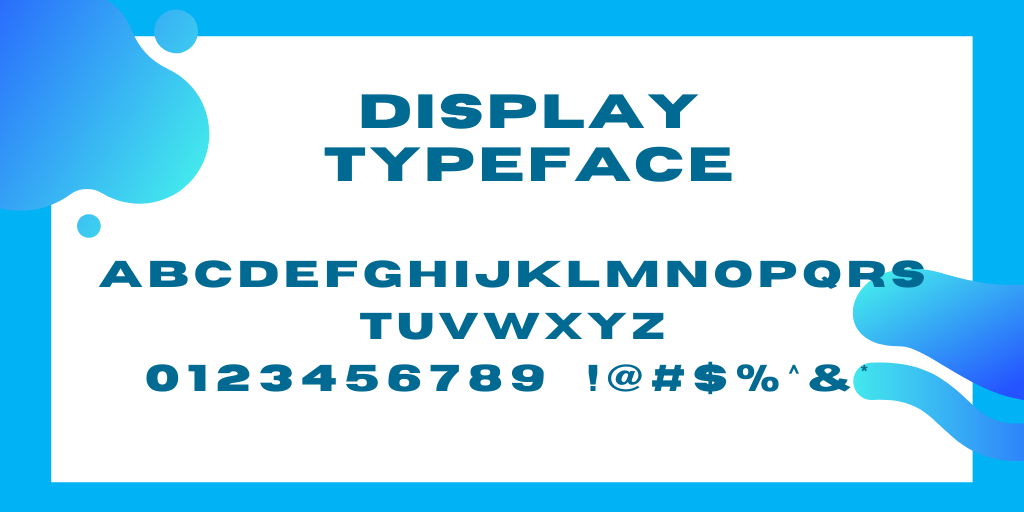
Combined decorative color and stylized fonts are called Display typeface. This typeface usually contains customized sizes and thicknesses. Most Display typefaces are commonly seen on the covers of books, e-books, commercial signages, billboards, promotional materials, etc.
Other categories of Display typeface:
- Grunge
- Psychedelic
- Graffiti
Friendly Tips:
Here are some useful tips for creating your typography:
- Start from sketching letters on your scratch paper.
- Determine every fonts and typeface that are suitable to your concept
- Avoid using thin fonts, they can be difficult to read.
- For headings, use only a few words or short phrases.
- Use other choices of typeface (Serifs or San Serifs) for subheadings.
- Organize the ideas based on your concepts appropriately.
- Pay attention to your spacings, and alignments.
- Apply an attractive combination of contrasting colors.
- Revise your typography if necessary, to look more appealing.
- Find your inspirational typographic designs.
Inspirational typographic designs
If you are brainstorming about creating a concept, we feature some famous wordmarks that became iconic and remarkable brands in all countries. Here are the inspirational wordmarks from well-known companies for ideal typography:
1. Instagram

A photo-sharing social media app features a logo that looks like a handwritten script. The font they used is designed by Russell Bean called Billabong.
2. MailChimp

Mailchimp is a popular marketing platform typically for email marketing and other delivery systems that are often used by many entrepreneurs and digital marketers. Their brand typeface used is called Cooper Light showing friendliness to users.
3. Coca-Cola
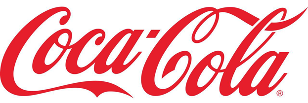
A famous beverage company worldwide with an eye-catching logo and filled with red color on it. In the year 1885, the logo of the Coca-Cola company was designed by Frank Mason Robinson, and the typeface used for a wordmark called Spencerian script.
4. Cadbury
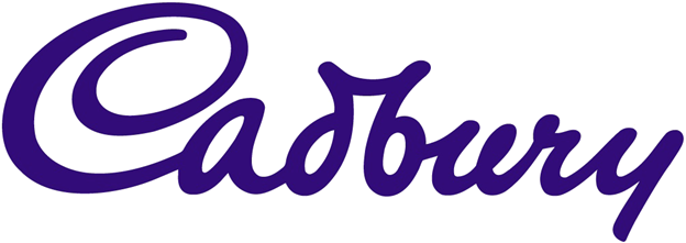
This confectionery company has a fashionable and well-designed wordmark making it more recognizable to consumers. It is written in Serif font and designed by Georges Auriol.
5. The New York Times

The American newspaper publishing company with huge influence and leadership worldwide. The latest wordmark with a black and white classical design was produced by Edward Benguiat. This wordmark’s style is similar to the Blackletter typeface, the first invented font in history.
6. Google

The most popular search engines with millions of users published the latest wordmark last September 2015 with colorful features and customized geometric san serif styled letters called Product sans.
7. Walt Disney
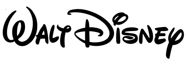
A favorite TV channel and entertainment that makes our childhood memorable. Did you know that the logo of Walt Disney is based on the founder’s handwriting? Sounds interesting. The closest font that you can use similar to their logo is called Waltograph created by Justin Callaghan.
8. Panasonic

One of the most popular electric manufacturers worldwide. The Panasonic wordmark used a classic san serif typeface, Helvetica Black making a simple but classy appearance.
9. Adidas
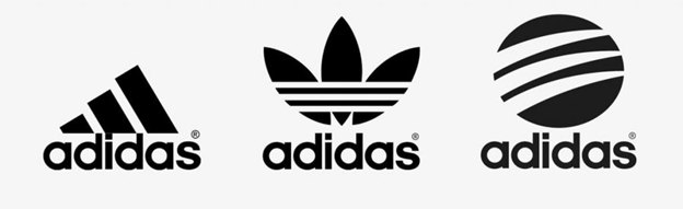
The shoes, accessories, and clothing manufacturer became famous and features an iconic logo featuring three-striped lines and a simple and classy font called ITC Avant Garde Gothic font.
10. FedEx
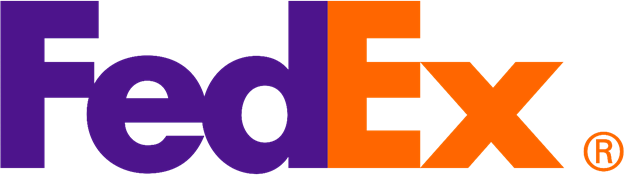
An American courier company used the Futura Bold combined with Universe 67 which was designed by Landor Associatesin 1994. It might appear simple and boring but has a clever concept if you noticed the arrow in the middle of ‘E’ and the ‘x’.
Conclusion
Typography and typefaces play a major role when it comes to making a wordmark for your branding and customizing your logo as well as it adds attractive designs for your website. It’s important to know the basic elements of it for enhancing your innovative creation. Build a concept first, by sketching letters or phrases on your scratch paper and follow the other tips provided above until you produce your typography.
Need a graphic designer for Typography?
Our skilled artist in specializing graphic designs of Canadian Web Designs has served many clients with satisfactory and high-quality of service. We are guaranteed that if you let our graphic designer create your logo, wordmark, business card, flyers, brochures, or other promotional things, you will react the same as our clients. So, don’t hesitate to choose us! Canadian Web Designs are ready to assist you all the time.
Share on facebook
Facebook
Share on twitter
Twitter
Share on linkedin
LinkedIn