The Imperative of Adaptive Web Design
In today’s digital age, having a flexible website that caters to various devices is paramount. The adaptability of your site plays a pivotal role in ensuring visitors’ retention and engagement. Despite its importance, many websites still suffer from common adaptive design errors, leading to diminished traffic and conversions. As the landscape of device usage broadens, from mobile to desktop to tablets, embracing a comprehensive responsive design becomes indispensable.
Top 9 Adaptive Design Pitfalls and Their Solutions
Having accumulated vast experience in web design, we’ve pinpointed the most recurring mistakes in adaptive web design. Here’s a list of the most common pitfalls and how to sidestep them:
1. Prioritizing Desktop Design
Initially, web designs were tailored exclusively for desktop screens. But as technology diversified, so did device screens. It’s crucial for designers to evolve from a desktop-centric approach and start designing with a broader perspective, incorporating varying screen dimensions.
The digital world once revolved almost exclusively around the desktop computer. In those initial stages of the internet, websites were meticulously crafted to cater to these machines. Yet, as the tech landscape expanded, so did the array of devices through which users accessed the web. From smartphones and tablets to wearable gadgets, each brought its unique screen specifications and interaction methods. Adhering to the outdated framework of a desktop-centric design now poses a risk of alienation for a significant portion of users. It’s no longer a luxury but a necessity for contemporary web designers to look beyond the desktop. Embracing a flexible approach that accommodates various screen dimensions ensures not only a broader reach but also a more inclusive and seamless user experience.

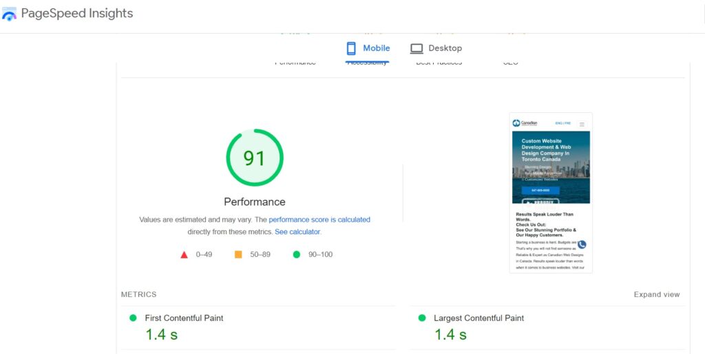
2. Extended Loading Times
The allure of high-quality graphics on a website cannot be understated. They play a pivotal role in enhancing the visual appeal, making the site more engaging and attractive to users. However, there is a drawback to this visual enrichment. Graphics, especially if not optimized, can substantially extend the loading times of a webpage. Prolonged loading durations can be detrimental, leading to a compromised user experience. Visitors might become impatient or assume the site is malfunctioning, leading them to abandon the page. But there’s good news – there are solutions. Techniques such as lazy loading, which loads images only when they come into the viewport, can significantly mitigate these delays. Additionally, using adaptive images, which adjust to the user’s screen size and resolution, ensures that only the most appropriate version of an image is loaded. Another efficient solution is infinite scrolling, where content continues to load as the user scrolls down, making content delivery seem seamless and swift. In conclusion, while graphics are essential for aesthetics, it’s imperative to balance this with optimum page loading speeds to ensure a positive user experience.
3. Concealing Content:
In the age of mobile-first design, the challenge is to present website content effectively across various screen sizes. One might consider trimming content for smaller screens as a feasible solution. At first glance, it seems logical – smaller screens, lesser content. However, this method can inadvertently harm the user experience. By hiding certain pieces of content from mobile users, one risks depriving them of potentially valuable information or features that desktop users can readily access. This could lead to perceptions of inequality and diminish the overall value of the website for those on mobile devices.
The more strategic approach is to prioritize adaptability. Instead of simply omitting content, designers should develop diverse layouts tailored for different devices. This ensures that users can access all content regardless of their device, but in a manner that doesn’t congest or overwhelm the interface. Content shouldn’t just be visible; it should be presented in a way that’s intuitive and user-friendly across all platforms. In essence, while adapting to varying screen sizes, it’s crucial to uphold the integrity and comprehensiveness of the content, ensuring a consistent and satisfying user experience.
4. Overlooking Touch Interactions:
In today’s digitally interconnected world, touch interactions have become second nature for many users. Gestures such as swiping to navigate, pinching to zoom, or tapping to select are foundational elements of modern mobile and tablet interfaces. Despite their ubiquity, it’s surprising how often these touch interactions are overlooked in web and app designs. Failing to accommodate these instinctive gestures can lead to a cumbersome and frustrating user experience, where navigation becomes a chore rather than a seamless activity.
For designers, the imperative is clear: adaptive designs must not only scale aesthetically across devices but also respect and incorporate the natural gestures of the platform. By seamlessly integrating touch interactions, designers can ensure that users can navigate effortlessly, access content easily, and engage with the platform in a manner that feels intuitive and natural. In essence, as the digital landscape continues to evolve, understanding and implementing touch interactions isn’t just an added feature, but a foundational component of user-friendly design.

5. Targeting Devices Over Screen Sizes:
The rapid evolution of technology has ushered in an era of diverse devices, each with its unique dimensions and display characteristics. In this dynamic landscape, a common pitfall for designers is to create layouts based on specific device types. Such an approach might seem fitting in the short term, but it can quickly become outdated as new devices emerge and older ones fade into obscurity.
The more foresighted and sustainable approach is to prioritize design around varying screen sizes rather than specific device models. By centering design choices around universal breakpoints, these layouts can fluidly adapt across a spectrum of screen dimensions. This ensures that the user experience remains consistent and optimal, regardless of the device in use. Moreover, as devices change and new screen sizes become popular, designs built on this principle continue to remain relevant and functional. In essence, by choosing to focus on screen sizes over devices, designers can craft experiences that stand the test of time, adapting gracefully to the ever-evolving digital ecosystem.

6. Inconsistent Font Sizes:
The digital era has gifted us with a variety of devices to access content, ranging from desktops to mobile phones. With each device comes different screen sizes and resolutions. A challenge designers often face is the inconsistency of font sizes across these devices. While a text may appear legible on a desktop monitor, it might become too small and unreadable on a mobile screen. This inconsistency not only detracts from the visual appeal but can also make users abandon the content out of frustration. Font size discrepancies across devices can disrupt user experience. Ensuring that text is legible and consistent across various screen sizes is essential. Moreover, concise content formatted for mobile devices enhances readability.
7. Tiny Action Buttons:
In an age of digital interaction, the design elements on a website or app play a critical role in shaping user experience. One such element that often gets overlooked is the size of action buttons. When these buttons are tiny or inadequately spaced, they become more than just a visual challenge; they pose a functional problem. Especially in touch-based navigation, where precision can vary due to finger size and touch accuracy, the minuscule size of buttons can lead to accidental clicks, missed opportunities, or user frustration. Minuscule buttons can be problematic, especially for touch-based navigation. Responsive designs must prioritize easy-to-click buttons to facilitate smooth user journeys.

8. Lacking User Insights:
Understanding the needs and intentions of users is foundational in the realm of design. Without these insights, there’s a significant risk of creating interfaces that miss the mark or are not intuitive for the end user. The development of detailed user personas is a critical step in this process. These personas, which are comprehensive profiles of idealized users, provide designers with a clear picture of who they’re designing for. By leveraging this knowledge, designers can craft experiences that feel tailored and intuitive, ensuring that users not only use the product but also enjoy and benefit from the experience.
9. Neglecting Testing:
Neglecting post-design testing can be a grave oversight in the design process. It’s essential to understand that designs that may look impeccable on one device might not translate as effectively on another. Testing across multiple devices provides an opportunity to identify and address any discrepancies or issues that might arise. By ensuring that designs are rigorously tested, designers can guarantee a more seamless user experience. This not only aids in user satisfaction but also minimizes the chances of unexpected design flaws cropping up in the future
Final Thoughts
Adaptive web design goes beyond mere aesthetics; it’s a powerful tool for amplifying user engagement and fortifying your online presence. In today’s fast-paced digital age, particularly with the rising importance of “Guide To eCommerce Website Design Best Practices in 2023“, ensuring your website functions seamlessly across devices is paramount. Being proactive in identifying and avoiding potential design pitfalls, coupled with consistent iteration based on feedback and rigorous testing, is the hallmark of a competitive online storefront. If you’re on the prowl for expertly tailored adaptive web designs in line with the best practices of 2023, don’t hesitate to reach out. We’re here, ready and equipped, to assist!